A Case of Design Psychology, the Tricks that We Use in the Design

Not long ago, I just finished my first E-commerce project. The project was quite interesting from many challenging aspects. One of them was about user’s psychological activity and I think it would be interesting to summarise and to share how analysing user’s psychological activity could help a UX designer to design a better thing.

Background, requirements and problems

The e-commerce website that we were designing has one very special aspect that most of the users were those who bought products from our client company. Our client would like to send vouchers/redeem code as promotion to their customer and attract them to the e-commerce website. Therefore, we put our design focus on the gift redeem.

From the client’s perspective, they have three requirements for gift redeem:

  1. Clear and intuitive entrance

  2. Users have to sign up/sign in to redeem

  3. Users need to input redeem code or their phone numbers

Looks very simple, right? Let’s make an obvious button, tell users that they can redeem after sign up/sign in.

But, wait! Why should I sign up?

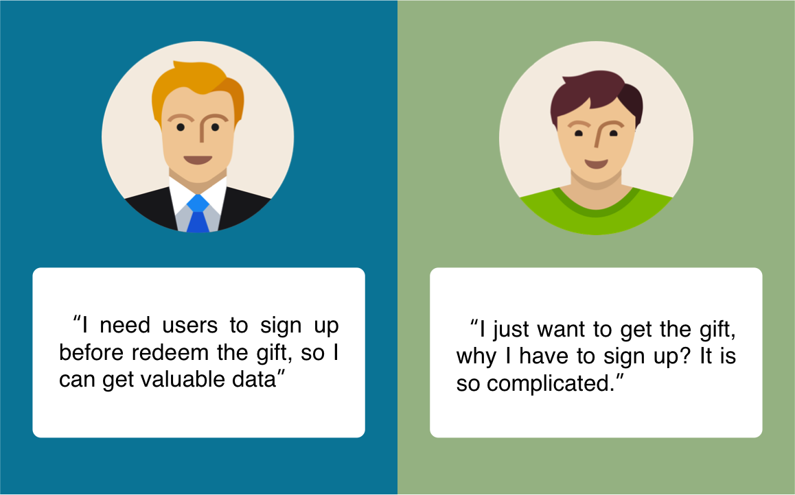
Client’s Requirements V.S Users’ Expectation

Client’s Requirements V.S Users’ Expectation

Business Flow ≠ User Flow

We all know that client thinks business objectives first. So the client described their thought on gift redeem to me like this:

“We could have a menu called Gift Centre, so the use can see it once entered the website and then click in (really?). And in the next page, you put a sign in box and tell users that they can redeem after sign in or sign up.”

And the client had drawn a interface like this:

What client thought for user flow

What client thought for user flow

Really.gif

hmmmm, really?

Sure for client it is very logical. They have provided the entrance for gift redeem, and told the user to sign up/sign in first, the user should follow the instruction and do what the client expected.

However, to the user, sign up is not a necessary step for them. When asking users to sign up, they think they are doing something not related to gift redeem, therefore dissatisfy and even give up.

As sign up is required, let’s look at all the steps in gift redeem and potential problems in each step:

User has different concerns in every step

User has different concerns in every step

The first step, insert the redeem code and enter the redeem process

First I want to say, in many designer’s view, the user is like this:

Things that are obvious to designers are not to the users

Things that are obvious to designers are not to the users

I really like this GIF. I don’t blame users. There are things that are obvious to designers but not to the users. This is because of the background knowledge and many other aspects.

So here if we analyse users’ psychological activity, we may find out what they are really thinking is:

“I got code, I got code, now where do I input it?”

So, we thought we had an obvious entrance, but it’s still not clear to the user. Especially when users click “Gift Centre” and find out there’s nothing to do with gift redeem (at least no direct relationship), users would think they went to the wrong place.

Therefore we hope to provide a clear and also participating entrance to the user.

Our design after analysing user’s psychological activity

Our design after analysing user’s psychological activity

While keeping the Gift Centre on the menu (of course we redesigned the Gift Centre page), we provided a large and obvious area for users to know they can redeem here.

As we analysed before, users are seeking for a place to insert their code, and here we provide it (Phone number is bound with the redeem code).

The important thing is, in client’s design, users will experience a long redeem process. Users would have seen two useless pages and you expect them to finish sign up and then redeem?

The redesigned page allows users to participate in redeem process from first page. Once users enter the phone number, they are already in the process and no matter what happened there, users will think it’s part of redeem process. This is how we play tricks next.

The Tricks

So you heard the story. A local coffee shop gives you a loyalty card that allows you to earn one sticker for each coffee you purchase. When the loyalty card is full of stickers, you get a free coffee. Here are two scenarios: Scenario A: There are 10 slots on the loyalty card and it was empty when you received it; Scenario B: There are 12 slots on the loyalty card and there are two stickers on it already when you received it. It is normally faster to collect stickers in scenario B. This is called “goal-gradient effect” that is described in the book “The Psychology of Design”.

So as it says, if the user find out that they have already made progress as in scenario B (although they still need to buy 10 coffee), they have more motivation to complete the task.

We also used goal-gradient effect in our design to motivate users to complete the sign up without complaints.

Using goal-gradient effect to motivate users to complete the sign up without complaints

Using goal-gradient effect to motivate users to complete the sign up without complaints

Let’s see what we have done in the design:

  1. After input the phone number in previous page, the system detects the number automatically. If it is a registered number it directs to login page. If it is an unregistered number, it enters the above page. Here we play a trick of red herring. If we ask users to sign up before redeem, users would think the gift redeem is a means of making them sign up (yes they are right). But if we put sign up process inside redeem process, users would think it is part of gift redeem process and therefore they would like to complete it.

  2. Using goal-gradient effect. With progress bar we notify users that they are already in the second step so making them feel like they have made progress and therefore would like to complete the entire process. The last step “Select Gift” is indicated as one step but it includes selecting product, creating address, check out and other steps. We put them as one step so the entire process (as what users see) is only three steps. When the user see there is only one more step, who cares about to sign up? You see, that’s how we play the thicks here.

  3. At last, we optimised sign up page. The mobile phone number (i.e. account number, the most common way to sign up in China) is automatically filled in. The verification code is sent once user enters the page. Therefore users only need to fill in two input box. As result, users won’t be trapped by the sign up process.

By analysing users’ expectations, psychological activities and using goal-gradient effect, we successfully increased sign up rate and users’ satisfaction. How do we know? Usability Testing!

Last Few Words…

It’s interesting to analyse users’ psychological activities. Especially when you find users are stepping into your “traps” and havn’t realized it. It is a big accomplishment for you.

It could be just a very small point to utilise users’ psychological activities, just like the gift redeem process (although we only mentioned half of it). There are only two pages but helped us sovle a big problem.

If you can not get help by business or technology (such as you can’t shorten or delete sign up process), designers could use users’ psychological activities by any tricks that you can think of. We use those tricks for good, to satisfy our users, and this is what makes user experience valuable and interesting.

It is always fun to play with users ;)


Original posted at Medium

洞悉用户心理,设计中的“诱导”和“欺骗”把戏

不久前,我在公司完成了自己的第一个E-commerce的项目。项目本身是很有趣的,涉及到了好几个有挑战性的设计点,其中和用户心理活动相关的一个设计点我觉得可以总结出来,分享一下一个用户体验设计师在设计的时候是如何通过分析用户的心理活动帮助设计的。

背景、需求和问题

在目前国内的环境下,当一个客户说我想要一个电商网站(类似优衣库、GAP这种品牌商除外)时,他们的意思是:“给我一个天猫或者京东”。这对于设计师来说发挥的余地并不大。不过我们客户想要的电商网站有一个特点,那就是用户都来自于购买了客户产品的顾客。用户在购买特定的产品后会获得兑换码然后从客户的电商网站兑换礼品。因此我们也把设计的重点放在了礼品兑换的设计上面。

从客户角度来讲,客户对礼品兑换功能有以下三个要求:

  1. 入口要明显

  2. 用户必须在注册/登录后才能兑换礼品

  3. 用户需要输入提前获取的兑换码兑换礼品

看起来很简单是不是?弄个明显的入口,告诉用户注册登录后可以兑换礼品然后就好了不是吗?等等,为什么我要注册登录?

客户的需求 V.S 用户的期待

客户的需求 V.S 用户的期待

业务流程≠用户流程

首先我们知道,客户在进行设计思考的时候,一般考虑的是怎样去达到自己的业务目标,所以当客户是这样给我们描述他们想到的设计的:

“我们把礼品兑换中心放到菜单上,这样用户一进来看菜单的时候就能看到,然后点进去(真的吗?)。然后你在下一个页面放一个登录框,告诉用户登录/注册后就可以兑换礼品了”

然后客户自己画了一张图,大概是下面这个样子

客户认为的用户使用流程

客户认为的用户使用流程

Really.gif

这样真的好吗?

当然从客户的角度来说,他们提供了礼品兑换的入口,又让用户知道礼品兑换需要先注册登录,用户应该乖乖按照这个流程完成兑换礼品了吧。

但是对于用户来说,注册并不是兑换礼品的必要步骤。因此在让用户注册的时候,用户会认为在完成一个和礼品兑换不相干的操作,从而导致用户产生不满,甚至放弃注册及礼品兑换。

既然注册是必须的,那我们先来看看用户在完成整个礼品兑换流程必须经历的步骤及可能的问题。

用户在每个步骤遇到的问题都不相同

用户在每个步骤遇到的问题都不相同

首先是第一步,输入兑换码进入兑换流程

在很多设计师的眼中,用户是这样的

有时候看似明显的东西对用户来说并不明显

有时候看似明显的东西对用户来说并不明显

事实上很多对于设计师显而易见的东西对于用户来说真的很难注意到,如果分析我们网站用户的心理活动,会发现他们其实想的是:

“我有了礼品兑换码,现在我要在网站上找到输入兑换码的地方”

所以,我们以为给用户了一个明显的入口,但是对用户来说还不够直接。特别是当用户点击“礼品兑换”后发现页面跟礼品兑换没什么关系,用户会认为自己走错了地方。

于是我们希望在首页提供给用户一个明显的,具有参与感的入口

在分析用户心理之后我们设计的首页界面

在分析用户心理之后我们设计的首页界面

在保留礼品兑换中心的同时(当然我们对内页做了新的设计),我们在首页第一屏提供了一个明显的区域,直接告诉用户来这里输入就能兑换礼品。

用户会像发现了新大陆一样输入他们的手机号(手机号和兑换码绑定),开始他们的兑换旅程。

这里对用户心理解读的关键在于,用户在之前的设计中会经历漫长的非兑换流程,在注册前已经经历了两个对用户毫无帮助的页面,你还会期待用户有耐心的完成注册再去兑换礼品吗?

而重新设计后的页面让用户在第一个页面就参与进礼品兑换的流程,从用户输入手机号的时候开始,用户就已经在流程当中,在这个流程里发生的任何事都会被用户认为是兑换流程的一部分。这也是我们接下来进行“诱导”和“欺骗”的基础。

“诱导”和“欺骗”

附近的咖啡店送了你一张积分卡,以后每买一杯咖啡就会在卡上贴一张贴纸,等积分卡贴满的时候,就能免费换一杯咖啡。下面是两种不同的情境: 情境 A :积分卡有 10 个贴槽,给你卡时所有的贴槽都是空着的。 情境 B :积分卡有 12 个贴槽,给你卡时已经贴上了 2 张贴纸。 使用B情景中的积分卡,收集满贴纸会更快一些。这是很多人都读过《设计师要懂心理学》里面讲的目标趋近效应。

简单来说就是如果用户发现他们已经有进展了,例如情景B(哪怕他们还是要买10杯咖啡),他们会更有动力去完成目标。

我们在设计中也利用了目标趋近效应,希望能够激励用户心甘情愿地完成注册。

利用目标趋势效应让用户更愿意注册网站账号

利用目标趋势效应让用户更愿意注册网站账号

来看看我们在设计中做了哪些考虑吧:

  1. 当用户在上一个页面输入手机号后,系统会自动检测用户号码,如果是已注册用户则会跳转到登录页面,如果是未注册用户,则会进入上图所示的页面。在这里我们采用了一种偷换概念的方法。如果我们要求用户在兑换前就注册,用户会认为礼品兑换是附属操作,客户的目的是要他们注册(虽然事实如此)。但是通过将注册步骤放入礼品兑换流程之中,用户会觉得注册是兑换礼品的附加操作,因此会更愿意去完成注册。

  2. 利用目标趋势效应,通过进度条提示已经进入了第二步,从而“诱导“用户感受到我已经有所进展了,更愿意完成整个流程。至于最后一个步骤其实包括了选择商品、下单在内的一系列步骤,但是我们将这些步骤都算为选择礼品步骤,从而把整个流程压缩到了三步,用户一看,还有一步就可以选择礼品了,谁还会在意需要注册呢?看,用户是怎样被我们“诱导”及“欺骗”到的。

  3. 最后,我们最优化了注册界面。手机号,也就是账号是通过“上一步”可以带入进来的,免去用户填写。进入页面后校验码自动发送意味着整个页面用户仅有两个输入框需要填写。配合进度条的刺激,我们可以进一步“诱导”用户完成当前操作。

通过分析用户的期望,在每个步骤的心理活动,以及利用目标趋近效应,我们成功的增加了用户注册率并提升了用户满意度。至于怎么验证我们的设计是否成功?可用性测试啊!可用性测试!可用性测试!重要的事情要说三遍!

写在最后

研究用户的心理活动是一件很有意思的事情。特别是当你发现用户一步步掉入你设定好的“陷阱”的时候还浑然不知有一种莫大的成就感。

对用户心理的利用可以在很小的一点上,就像这个礼品兑换流程(其实这里只说了一半),也就两个界面,但是很好的帮我们解决了用户注册过程中跳出率高以及用户满意度的问题。

在一些业务或技术无法解决的问题上(例如注册的需要或步骤无法缩短),设计师可以从用户的心理角度善加利用,无论是“诱导”还是“欺骗”,我们的目的都是为了让用户更满意,这也是用户体验设计的价值和趣味所在。

毕竟,和用户“斗”,其乐无穷啊!


Original posted at Medium