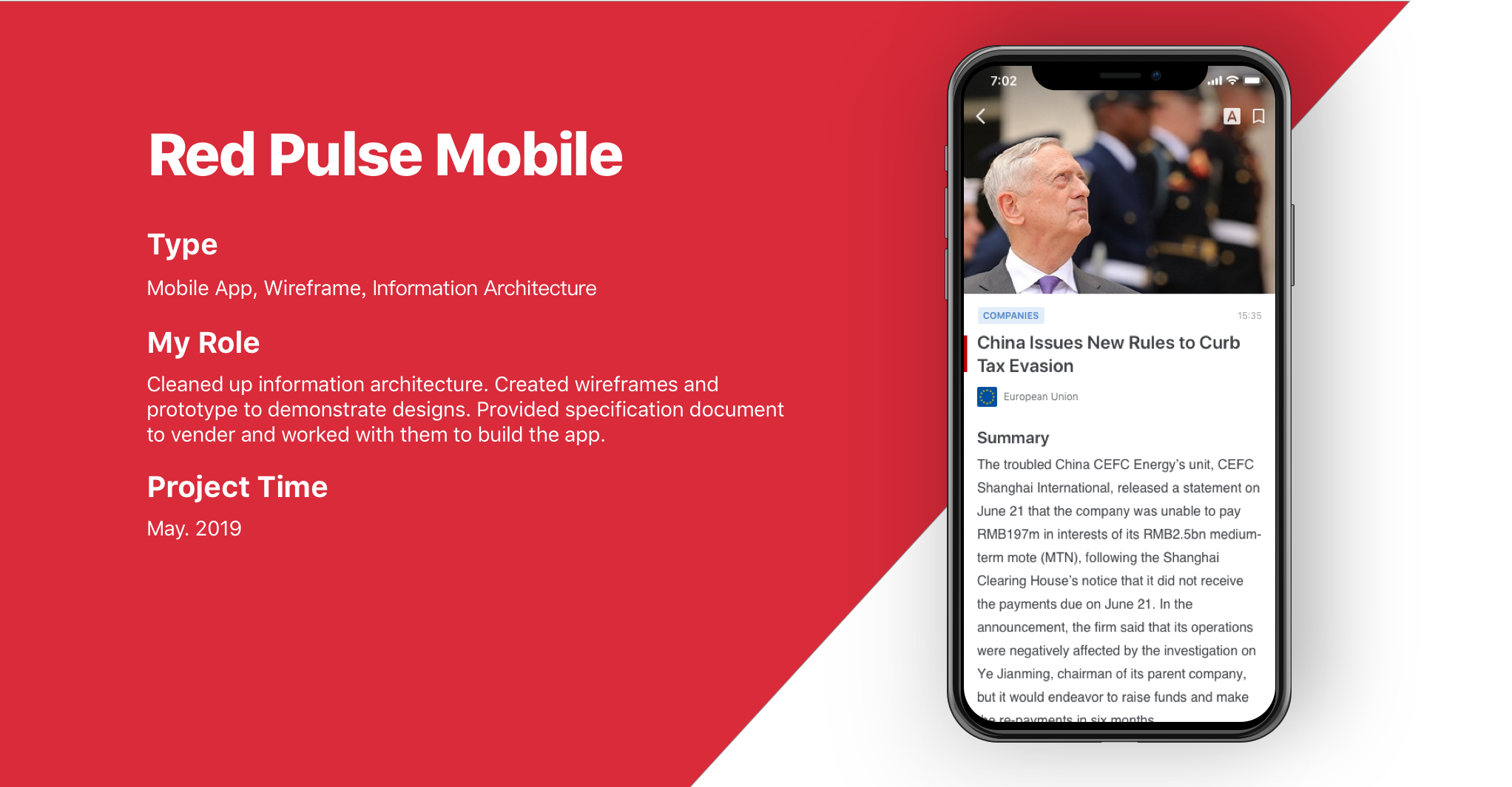
PROJECT BACKGROUND
Red Pulse Mobile App is a mobile application that provides Red Pulse platform contents to its users. We designed and worked with venders to built the app that allows users to view all types of contents. The app has less features compare with the web version, so we re-organized the structure and focus on the user experience.
Information architecture

The mobile app has almost everything as the web platform but without signup, workspace, wallet and part of the settings.
Design Iteration
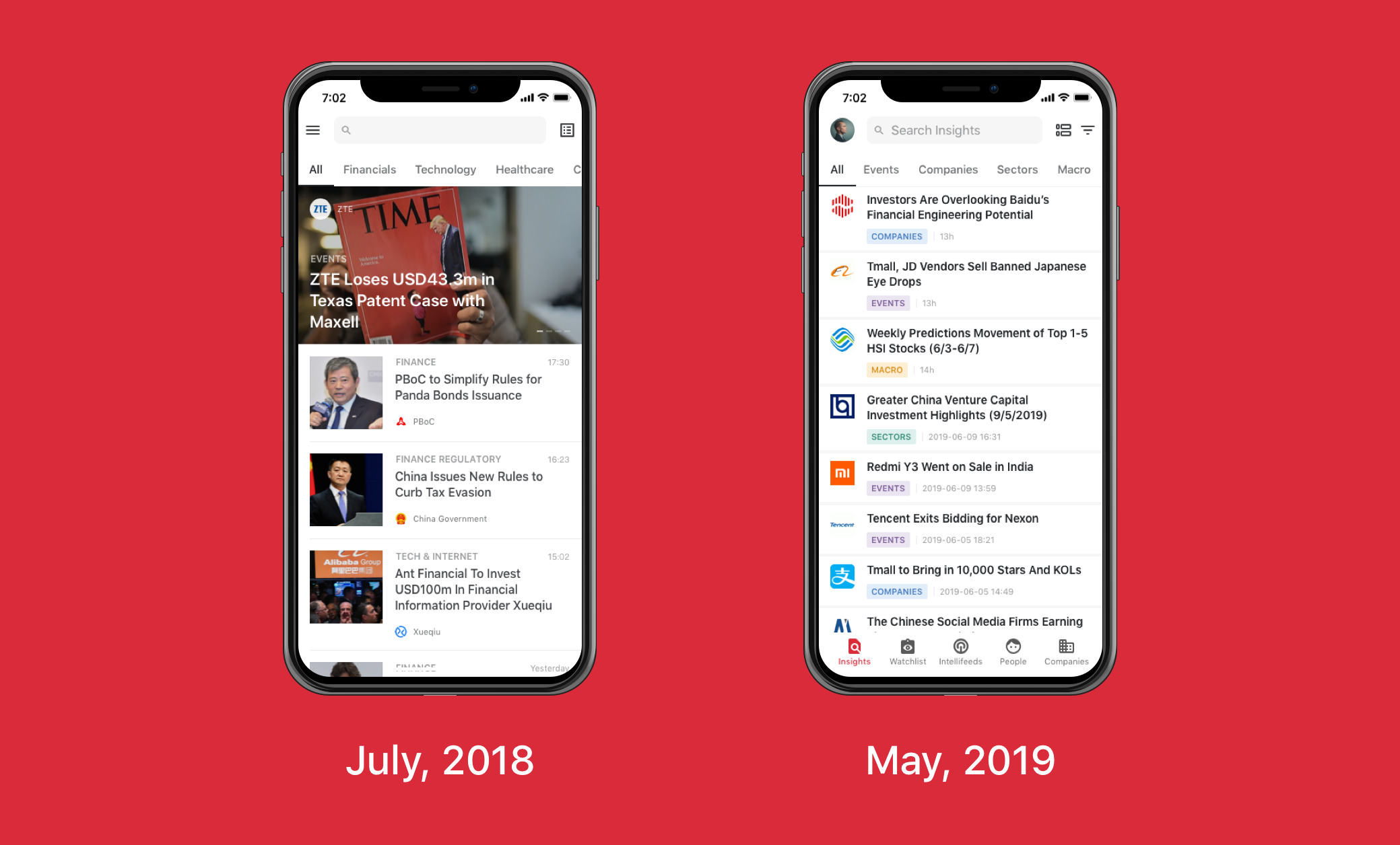
The first version of the app came out in July, 2018 and it only displays articles. In May, 2019, we upgraded to what it looks like now with features listed above.
We also changed the style to a more professional view according to feedback.
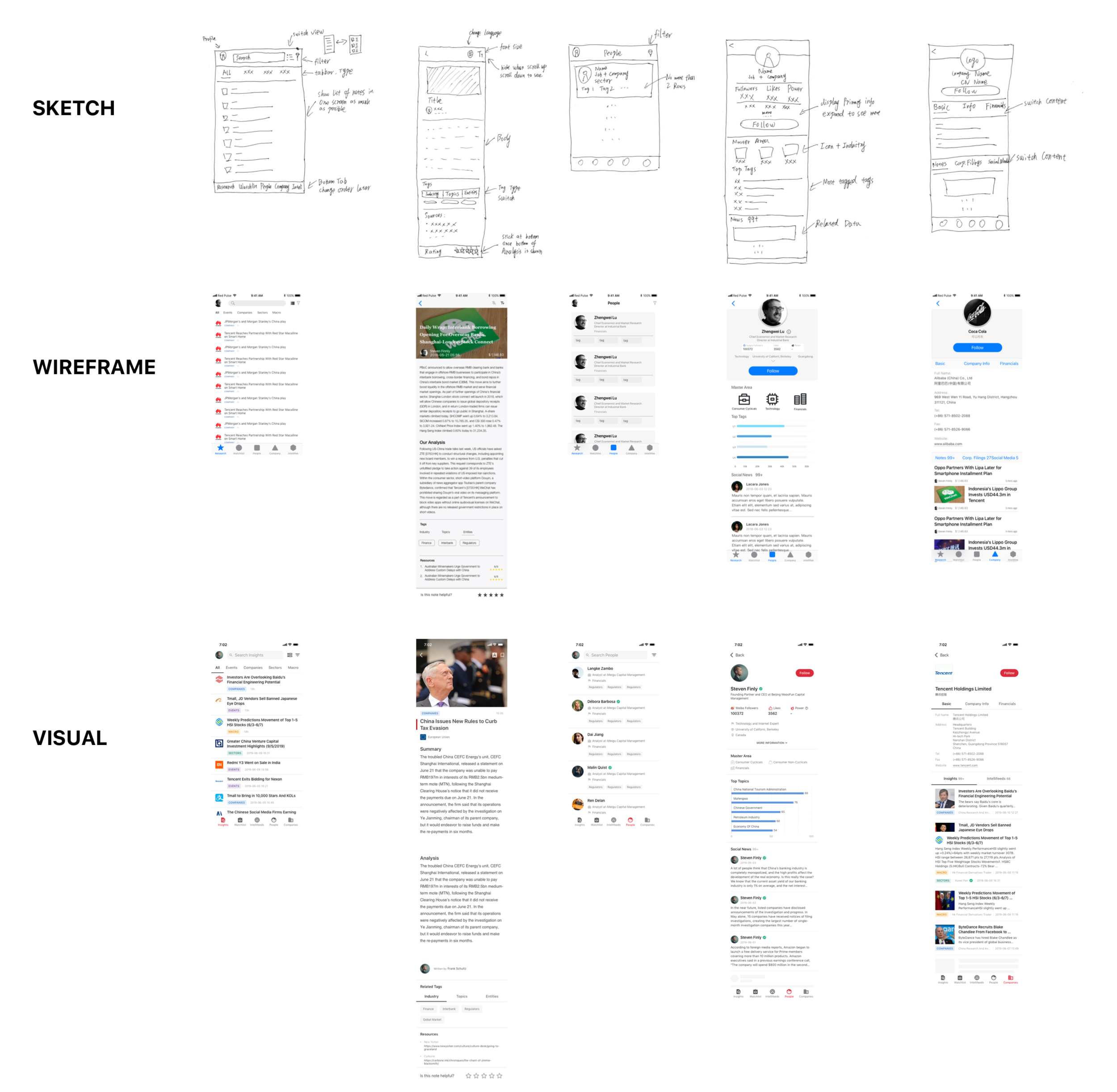
I started creating rough designs on papers and tried to get an immediate feedback from others. Then I created wireframes in Sketch with real data. This process has been repeated several rounds to get to the final design.
Design Considerations
One of the challenges when designing the watchlist was that it consisted of many actions such as create, template, edit tags, search tags, etc. The first thing I did was to take watchlist out of insights and make it as a standalone option in the bottom navigation. Next, just like what I do often, I prioritized information, making sure the main flow is obvious and natural, hide secondary options. I designed immersive guides for users to discover other options such as empty state tips, tooltip, animation, icons, etc.

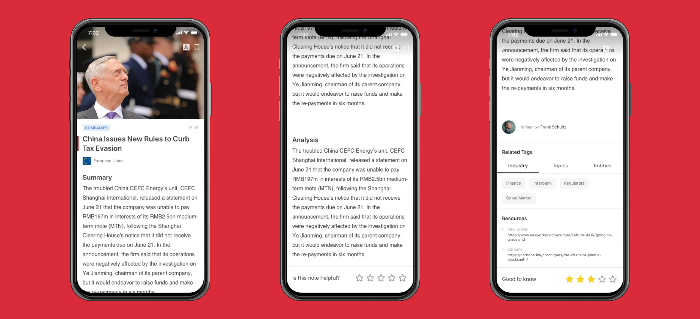
To provide an immersive reading experience and make sure readers would give a meaningful rating, the rating bar will not appear until reader scrolls to the bottom of the body of content, and the bar will then stick at the bottom of the screen. The rating is also designed that can be changed in 5 minutes. After that, it cannot be changed as ratings is part of our payment criteria.
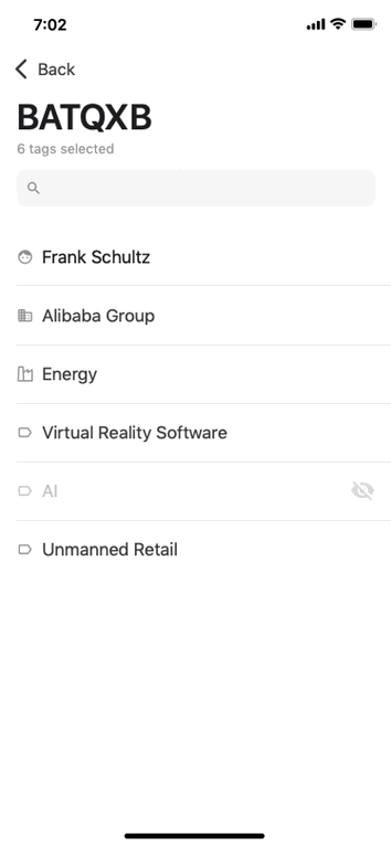
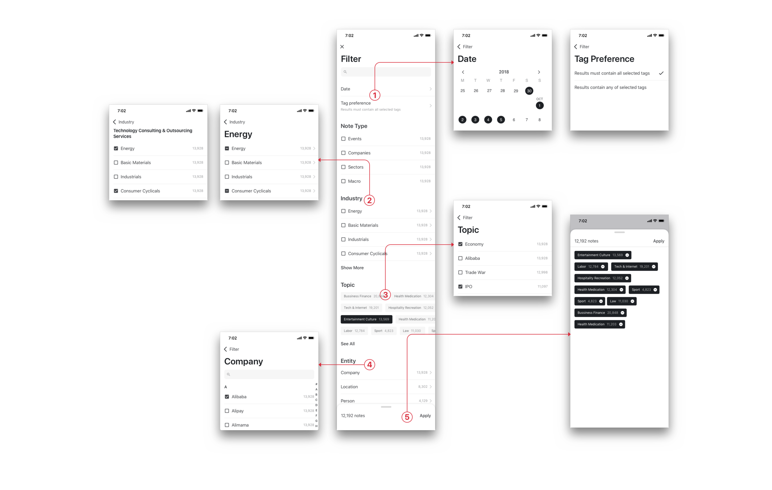
Filter is another challenge. On the website, it is easy to expand, navigate, and edit in one screen. However on the mobile, due to the screen size, the items are cascaded. The first thing to consider was the form of selections. For example, Note Type is important and only has 4 options, so we display it directly. For industry, we only display top ones and others are cascaded. Topic is random and time sensitive, therefore we allow users to scroll horizontally to see top topic tags. Once users enter Topic page, they’ll see full list of topic tags ordered by number of articles. For Entity, I categorized items alphabetically making it easy to navigate. Last, the selected tags are displayed and sticked at the bottom bar where users can scroll to see all selected items instead of looking for them in different pages.
Design Specification
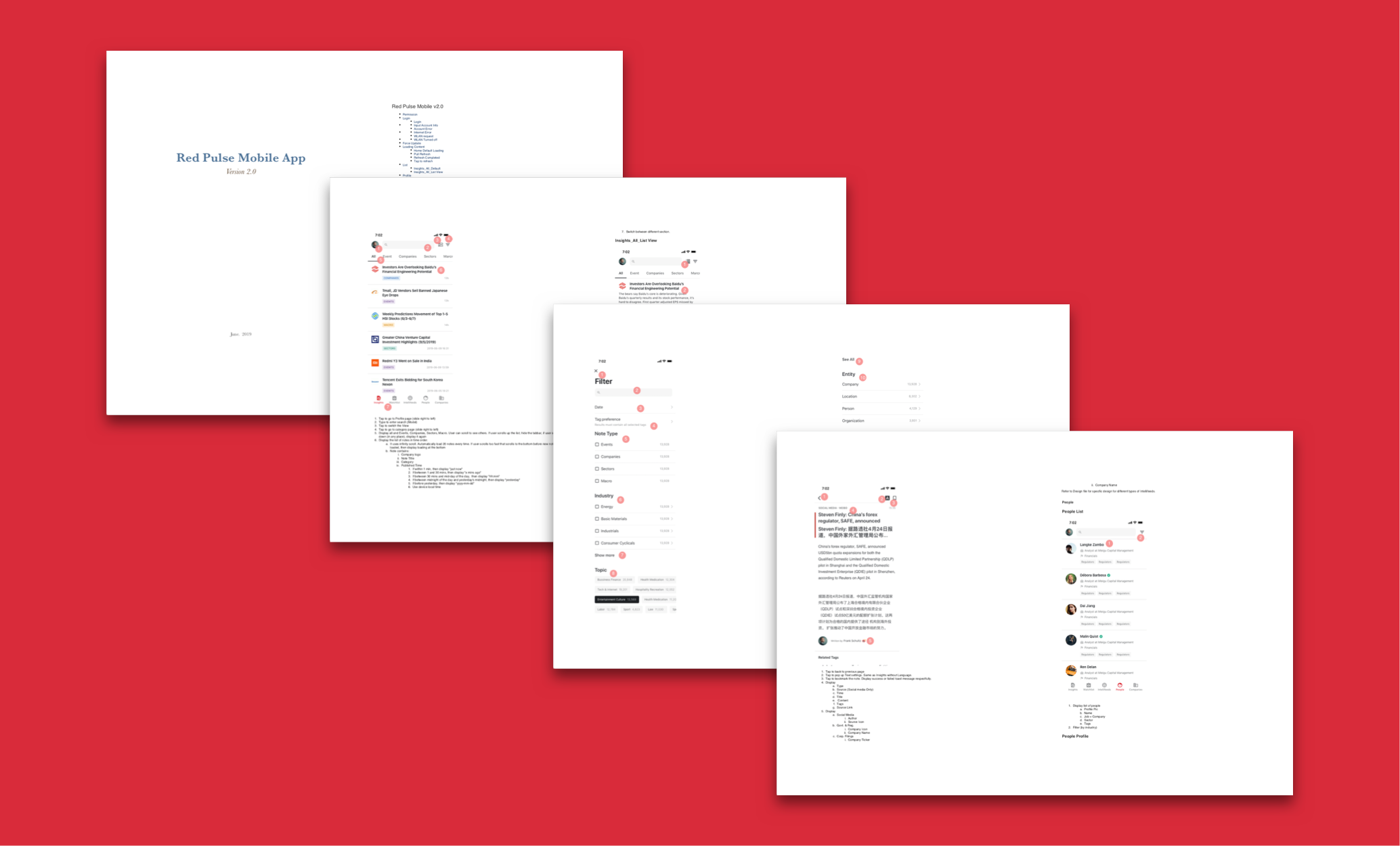
As we only took the design part in house and it would be developed by a vender, I prepared a specification document for the vender to follow.
FINISHing PRODUCT
Because the app would be developed by the vender, unlike the web platform using agile, we took waterfall process to build the app. Nevertheless, we were sort of agile when designing the app. I created wireframes and prototypes and often modified my according to feedbacks. I believe the earlier we get the feedback, the less mistakes we would make. After final confirmation, we started visual design, specification document and then handed to the venders and worked with them together to build the app.