PROJECT BACKGROUND
EF Mobile Classroom provides an alternative way for students to take online private and group classes. Currently 24% of private classes and 23% of group classes are taken on phone and tablet. Since the mobile classroom was designed a long time ago, student feedback and regular testing results indicated that the interaction was not intuitive and the UI was outdated.
This was primarily a design driven project that I set out to design a new version of the mobile app and tried to get approval by management. I need to present the reason of redesign (luckily, previous testing results had already shown the need of optimization, I just need to summarize and validate again), and the new concept that would improve the experience.
Usability Testing
At EF, we do usability testing regularly. Thus I already had information in hand, but I’d like to run a usability testing again specifically for the redesign purposes to have an up-to-date insight about the Classroom app.
The main experience problems of current app centered in information architecture, content discoverability, awareness of status, task-handling and complexity of user-flow.
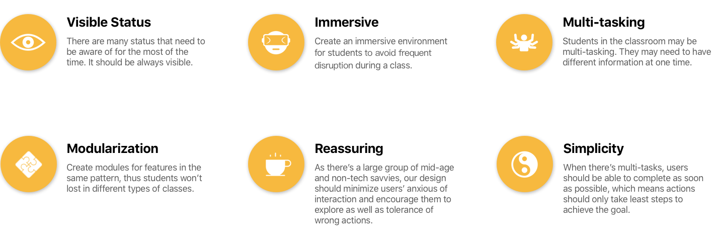
Design Principle
I had a brainstorming session with our design team looking for directions to solve problems. Here’s what we concluded.
Apply Principle into design
During the class, students’ microphone, camera status could be changed by the teacher. Previously as the status were hidden in the side bar, students couldn’t notice that. Now they are visible to students all times and least interrupted.
Same problem happened to chatting text. It was hidden and users had to switch between chat panel and the slide. It was much worse in the group class as teacher might chat with someone else and students didn’t know until they open chat panel, and consequently their learning experience was interrupted. I designed the chat area at the bottom left side. Only when there is message, it will be displayed. Students can always know what is happening while keeping focus on the slide.
Inherited from previous core interaction, users can tap on the screen to call more actions. The status are notably enlarged and some icons now can be tapped to change the state. At the bottom, user can type text to send messages and also check other student's’ status. At the right side, user can call out the notes panel. Instead of having note panel only as previous design, we could utilize the space to display both slide and notes.
The tablet version is slightly different but follows the same principle. As the screen size is much bigger, many actions can be directly put on the screen and notes can be displayed over the slide. Due to the screen ratio of the tablet, I used push-in panel for the note section on tablet.
Final Thoughts
The new design provides an immersive learning environment, and status are intuitive to users to notice any changes to them. I put the slide as the core to focus but also allow users to do multiple tasks at same time. To define design principles or directions are important before design, we know what problem to solve and also what we should keep in mind.
The concept had been presented to the management and received great feedback. Unfortunately I left EF soon after the presentation, but this project was carried on.


