
PROJECT BACKGROUND
In 2015, CPIC wanted to launch their new e-commerce website to better serve their customers. Just like many other companies, CPIC wanted to copy the leading e-commerce websites in the market, therefore there were more about the details instead of creativity. Despite that, this project had one very special aspect. Most of the users were those who bought insurance from CPIC, and then received vouchers/redeem code as promotion to attract them to the e-commerce website. Therefore, I put our design focus on the gift redeem process.
Competitive Analysis

We analyzed major e-commerce websites to understand what information should be included in each process and why.
Potential Problems
Too easy to get visual similarities. Brand identity may be too weak
Navigation is important as features/modules are many and fragmented
Too many colors may result in lost on the site
Users may not be able to complete objectives if the information hierarchy is not clear
Highlights
Variation of product display
Promotion banner is visually eye-catching
Striking colors
Design for user objectives
Persona & Scenario

Requirements V.S Expectation
From the client’s perspective, they want user to sign up before redeem the gift and therefore get users’ information.
But user just want to get the gift, why they have to sign up?

“We could have a menu called Gift Centre, so the use can see it once entered the website and then click in (really?). And in the next page, you put a sign in box and tell users that they can redeem after sign in or sign up.”
Original Redeem Process User Flow
The client had an idea of how to redeem like this:
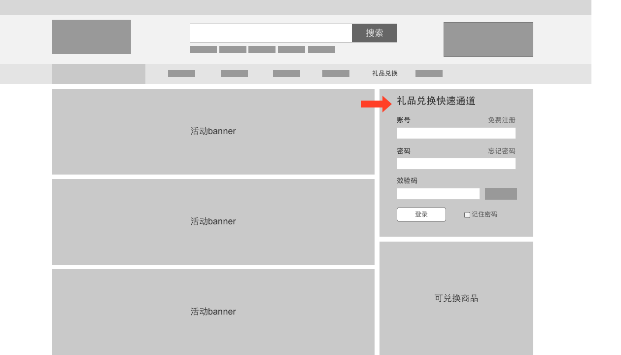
Homepage > Gift Redeem Center > Register/Login > Input Redeem Code
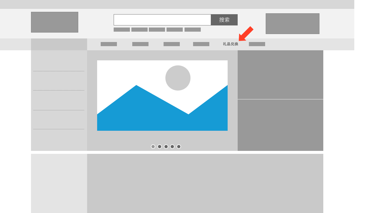
Where’s the entrance?
Why do I need to register?
Where do I input the code
It's understandable for a client to think like this. They have provided the entrance for gift redeem, and told the user to sign up/sign in first, the user should follow the instruction and do what the client expected. However, to the users, signup is not a necessary step for them. When asking users to sign up, they think they are doing something not related to gift redeem, therefore dissatisfy and then give up.
Solution – Be Obvious

Analyzed users’ cognitive path. The first thing users consider is: “I got the code, now where do I input it?”
A dedicated area for gift redeem.
Users are seeking for a place to input their code, and here we provide it (Phone number is linked with the redeem code).
Get rid of useless pages.
Be cautioned that users may give up if they are asked to sign up before redeem the gift.
Play a Little Trick
The redesigned page allows users to participate in redeem process from first page.
Once users enter the phone number, they are already in the process and no matter what happened there, users will think it’s part of redeem process.

Using “goal-gradient effect” to increase user participation rate. Users will find out that they have already made progress to step 2, they have more motivation to complete the task.
Mobile No. (account No.) is auto filled in. Verification code is auto sent. Users only need to fill in two text fields.
Wireframe

Yes! It’s responsive!
Hybrid grid.
Responsive contents & responsive modules.
Ready to see interactive responsive design wireframe.
Description of responsive rules in every wireframe page.

Who wants to see documents?
No complicated documents, all in one wireframe file.
Explanations of blank status, variations. Trouble free for front devs.

Web app version is also available on mobile phones.
Final Work


Management
I also took responsibilities in project management. There were 2 other UX designers and 3 UI designers involved in this project and I was responsible for managing the project progress, assigning resources, daily work management, quality assurance and then report to manager and client.

I have also written an article about this project, take a look: A Case of Design Psychology, the Tricks that We Use in the Design