Project Background
EF Classroom is the major study tool in EF students’ study cycle. It is available on multiple browsers and mobile apps for both iOS and Android. Before entering the classroom, it is required for teachers and students to take a Tech Check, which aims to make sure their internet, video, and microphone etc. are working properly.
The customer support team has consistently reported issues that users have experienced. Although the root cause was majorly technical issue, and the development team was trying to solve problems in their way, I also found many UX problems that amplified technical problems. I initiated the project and got approved by management to implement the solution.
Process Overview
The first time I used Tech Check, I realized there was a lot of things could be improved. I went to customer support team and collected feedbacks regarding Tech Check and found out many customer complaints could be solved or reduced through UX improvements. I’ve also completed an evaluation on the current Tech Check flow with some designers and developers. Then I had an image of where to improve.
Next, I started wireframing. With wireframe that indicated how the problems could be solved, the management agreed to add this project to the pipeline. I then carried out usability testing on real users to understand the behavior and validate the problems. Based on the result, the new Tech Check has been finalized and developed.
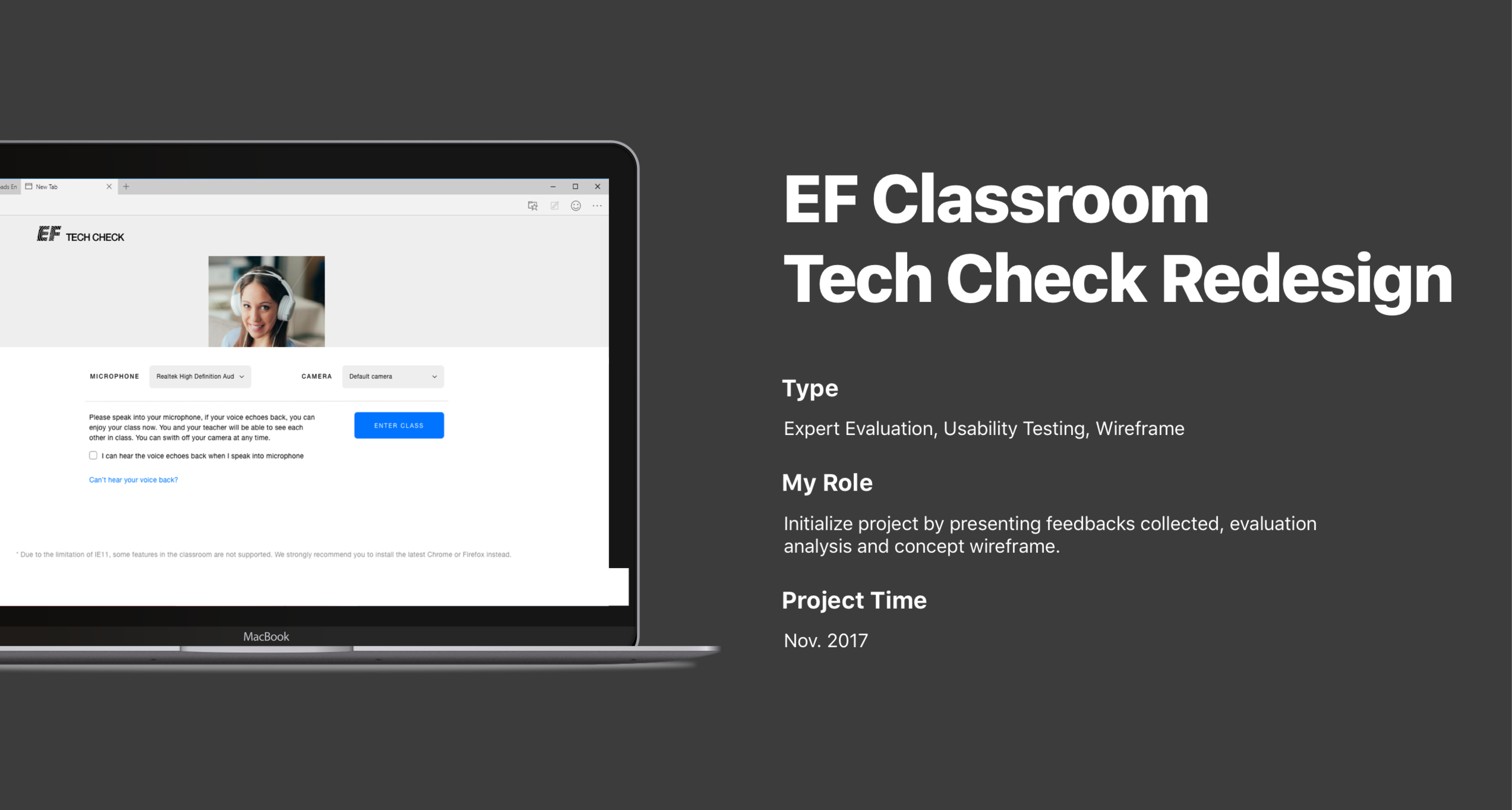
Original Tech Check
As the feedbacks were collected and an evaluation was completed, the following issues were identified as the major problems we were going to solve:

Too much information.
Irrelevant information in one-page view.
Annoying audio check.
Final step looks too similar to processing step.
There’s a freeze when switching from local check to remote check.

The process indicator doesn’t really match the current state. While it says Audio Device Check, it’s also checking video at the same time and then gives video device check result afterwards. Therefore when user is in step 2, one will be confused as there’s also a camera video showing one’s self.

The page includes a progress bar, camera check, microphone check, problem description, and transmission indicator. The user would easily lose what to do on the page, especially the camera was moving all the time.
Re-designed Tech Check
We set out the direction of the re-design was to focus on providing a clean interface, let users focus on one task per time, and prioritize the information.


The failure states now focus on one thing at a time only. We separated problems and solutions to make it clear to users what happened and what’s next step.

For complicated problem solving tips, or secondary information, we moved them into a pop-up where only displayed if user wanted.
Final Thoughts
The new Tech Check has been launched 2 months later after the proposal. Later we added some other little things for different states, but I tried to keep everything under the principle to avoid becoming overstaffed again (Using pop-up instead of add into the page directly and Gestalt to organize information). Later when looking at the report, the Tech Check pass rate had increased significantly and student complaints had dropped.