
PROJECT BACKGROUND
Nowadays, mobile app is a major entrance of bank services. Bank of Hangzhou also relies a lot on their mobile banking app and we were approached to redesign the experience of their mobile app.
Banking is one of the most complicated services and jargons are heavily used. I spent lots of time to understand all kinds of services they provide and major issues were found as below:
Due to the design constraints, all features are tiled without categorization and hierarchy.
Too many redundant steps to complete a task.
UI is outdated and lack of user feedback.
Thus the main goals of the redesign include a cohesive type, color and language system, improved information architecture, content discoverability, simplified user flow and a mind on extensibility.
Competitive analysis
I have tried out many banking apps and financial apps on the market to see which had the best experience, why the experience is good or bad, and what I can learn from them.

Using icons to indicate different features on the home page
Using “Hamburger” or Bottom Tab to categorize features based on apps’ core business
Some are using creative ways to interact but the experience is not the best (e.g. CCB, PSBC…)
Importance of better banking app experience includes simplicity, discoverability, user feedbacks, etc.
Information Architecture
Information architecture was the most important part of this project as it was the major problem of current app and it was important to content discoverability. I analyzed the current information architecture and worked out the new hierarchy. Features were categorized in a way that users were able to understand where features were located and how to navigate through.

I created this information architecture to re-organize their features. Many small features were grouped together into a module. Based on the information architecture, the method of navigation and homepage can be decided
Wireframe
I sat close to the client therefore I can get feedback everyday and I had been through 4 rounds of proper design reviews with clients. At last, over 100 wireframe pages had been created and made to clickable interactive wireframe for users to test.

Homepage optimization
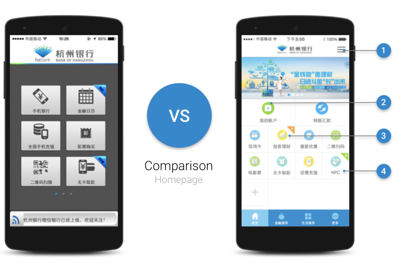
Sidebar + tabbar are used specifically for complicated bank services. The sidebar of any major page serves to cross-link users to other major content, which was one of major user needs for bank app. This helps the user find what they are looking for and discover additional helpful content without having to dig through nested menus.
Based on user research, we prioritized main features for users
Blocks direct users to internal and external content pages that are most relevant to what user needs. Icons are differentiated with other apps to create better recognition.
Using flat design, bright, clean color palettes to delight our users and broadcast the brand identity
Accessing My Account

The content was nested deep in the hierarchy. User has to click four times to get to the details.
Users have too many choices. But the most frequent used one is hidden.
Confusing navigation. Tabbar appears in sub menus but not in the homepage, users are easy to misclick it and have to go through the process again to get back.

Optimized path to access My Account page. I focused on users’ main objectives, move secondary activities afterwards such as card selection and have three main features (My Account, Debt, Credits) into one page.
Transfer

As one of the most frequent used feature, it is hidden, transfer is a pain to the users.
Users have a simple task that is to transfer but they have to understand different types of transfer and jargons.
Tabbar is unnecessary in transfer page as transfer is an immersive environment.
Icons and layout provide no help but misleading users.

The system will be intelligent enough to help users fill out the form.
Focus on users’ primary needs (transfer), then make other compulsory actions (transfer type)
One-way process to avoid back and forth and focus on current task.
Once the process is completed, provide other useful options instead of a dead end.
OTHER DESIGNS

Bank of Hangzhou mobile banking app won “The Best User Experience Mobile Banking App of Regional Commercial Banks”